Contact Details
sales@thrasker.com (813) 565-9024 10901 Danka Circle North, Suite BSt.Petersburg FL 33704

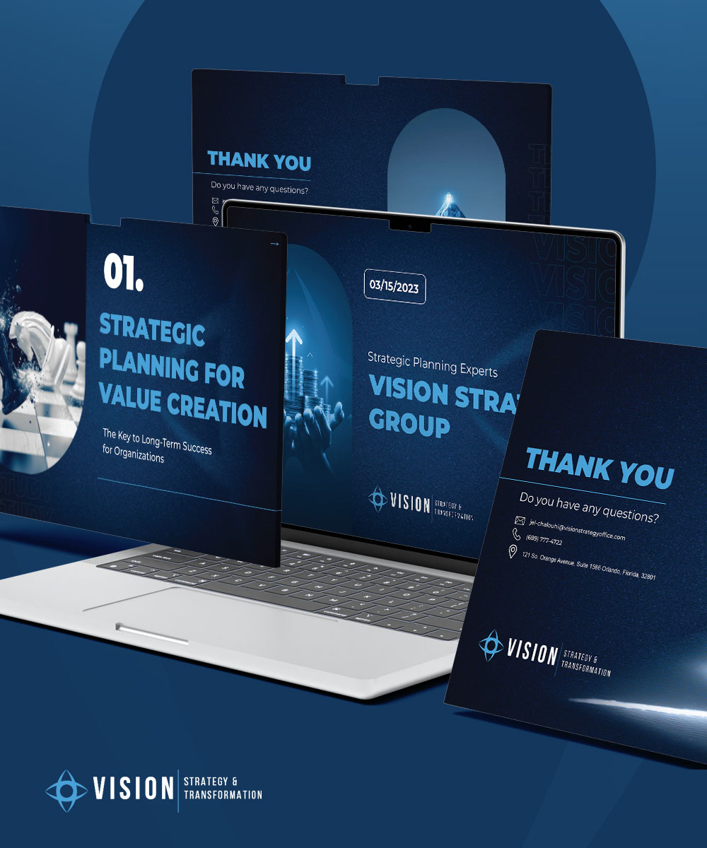
The "Vision Strategy Group" presentation design is a compelling
narrative told through a series of slides that combine
sophisticated graphic elements with a consistent and focused color
palette to convey the essence of strategic planning and
transformation. The deep blue background is not just a visually
striking choice but a strategic one, symbolizing depth, stability,
and knowledge — critical attributes for a company that deals with
strategic foresight and planning.
In each slide, the color blue is used to create a solid, coherent
background that allows other elements to stand out. This color
choice is deliberate — blue is often associated with trust,
efficiency, and communication, which are key to the brand's
identity as strategic planning experts. The darkness of the blue
also gives the slides a professional and serious tone, suggesting
that the Vision Strategy Group is a leader in its field, capable
of guiding organizations through complex transformations.


The use of white and light blue in the text and graphics serves as a contrast, ensuring readability and directing attention to the content. This contrast is crucial in maintaining the audience's focus and conveying the message clearly and effectively. The choice of a sans-serif font adds to the modern and clean aesthetic, which aligns with the forward-thinking attitude of the company.
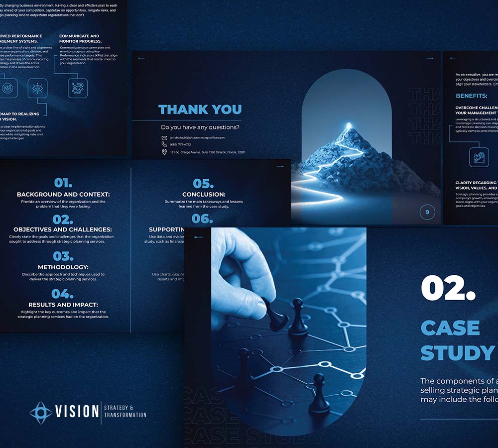
The imagery used in the slides is both metaphorical and literal. The mountain peak bathed in light represents the summit of success, the goal that clients aspire to reach with the help of the Vision Strategy Group. It's a powerful visual metaphor for achievement and aspiration. Similarly, the chess pieces speak to strategy and the considered moves required in business planning.
The layout of each slide is meticulously organized, with a clear
hierarchy of information. The designers use scale, alignment, and
proximity to create a sense of order, which helps in guiding the
viewer's eye through the content in a logical sequence. This
organization of visual elements is key to effective communication,
especially when dealing with complex strategic content.
Interactivity is subtly introduced with icons and visual cues that
suggest a dynamic presentation. While we cannot see the motion,
the design hints at it, suggesting that the Vision Strategy
Group's strategies are not static but evolving and responsive to
the changing business landscape.
