Contact Details
sales@thrasker.com (813) 565-9024 10901 Danka Circle North, Suite BSt.Petersburg FL 33704

The "K9 Kake" dog food packaging design is meticulously crafted to
communicate quality and appeal to both dog owners and their furry
companions. The packaging comes in two distinct types, each
catering to different preferences and showcasing the brand's
dedication to providing nourishing options.
Both packaging designs feature consistent branding elements,
ensuring a cohesive and recognizable look across the "K9 Kake"
product range. The typography choice is clear and modern, adding
to the overall sense of quality and trustworthiness. The careful
balance between visuals and typography results in packaging that
is visually appealing, informative, and emotionally resonant.


The design process for the "K9 Kake" dog food packaging began with a comprehensive understanding of the brand's values and target audience. Extensive research into the pet food industry and consumer preferences guided the direction for the packaging's visual identity.
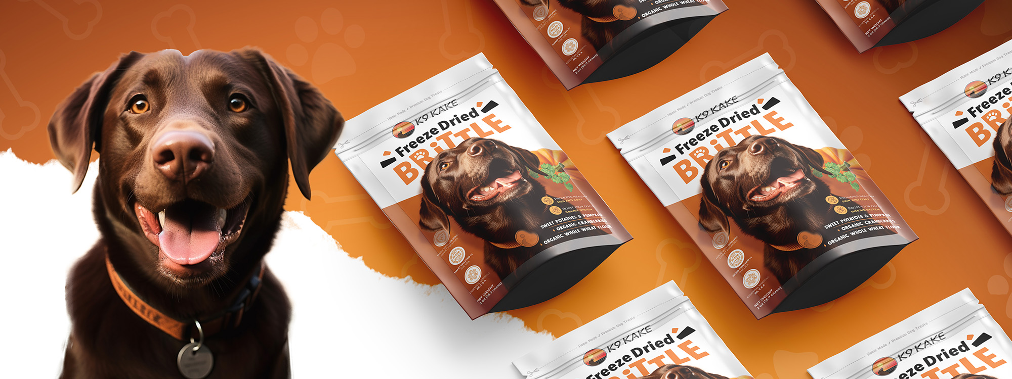
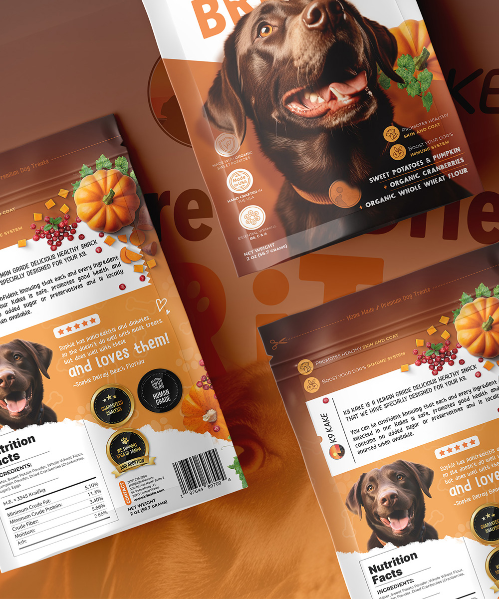
For the "Freeze Dried Brittle" packaging, the concept focused on showcasing the product's nutritional value and energy. A central image of a joyful dog conveyed vitality and health, while the typography "Freeze Dried Brittle" was meticulously chosen for legibility and a touch of playfulness. The dual-colored background, half white and half orange, was designed to symbolize purity and vibrancy, aligning with the product's promise.
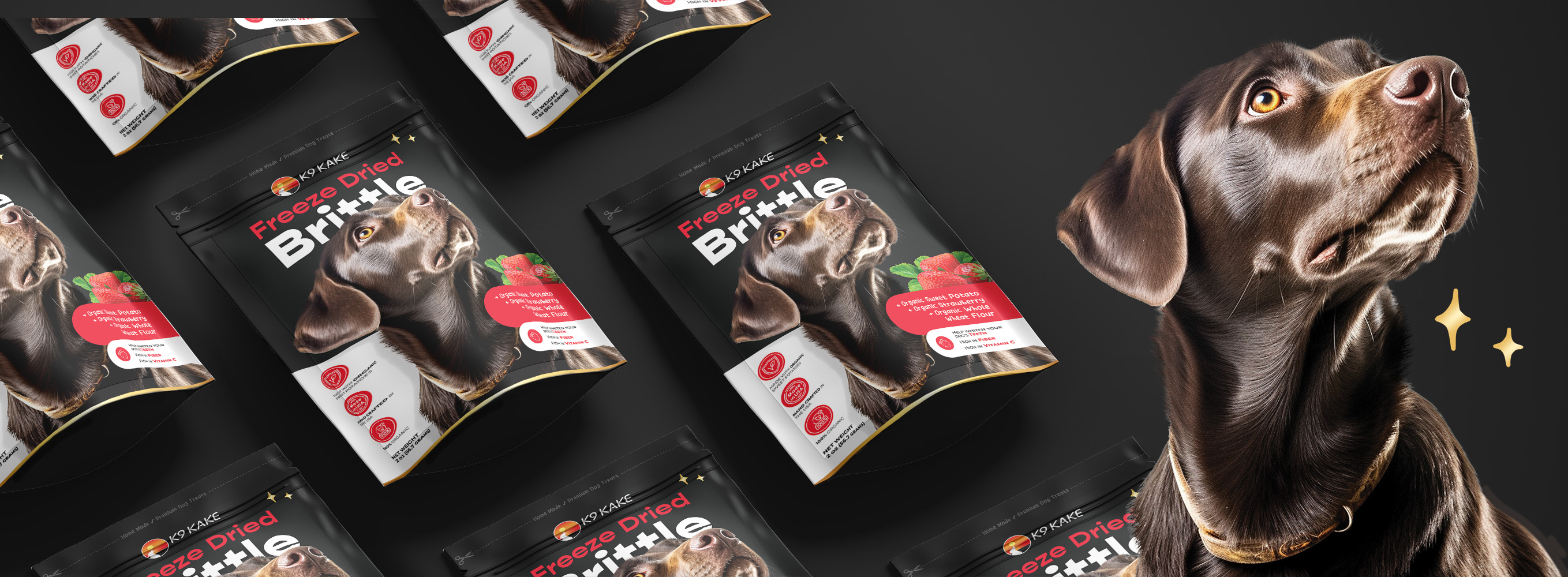
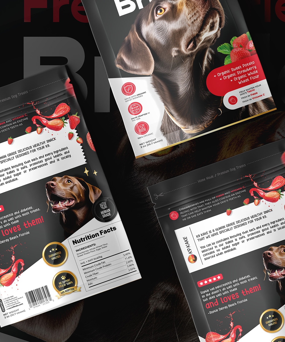
The "Premium" packaging, on the other hand, aimed to evoke a sense of indulgence and high quality. A sophisticated dog accompanied by fresh strawberries created an appetizing and visually appealing scene. The sleek black background exuded luxury, while the touch of white at the bottom allowed crucial details to shine, resulting in an elegant and eye-catching design. Consistency across both packaging designs was paramount to establish a strong brand identity. The typography remained clear and modern, ensuring readability and alignment with the brand's essence.
