Contact Details
sales@thrasker.com (813) 565-9024 10901 Danka Circle North, Suite BSt.Petersburg FL 33704

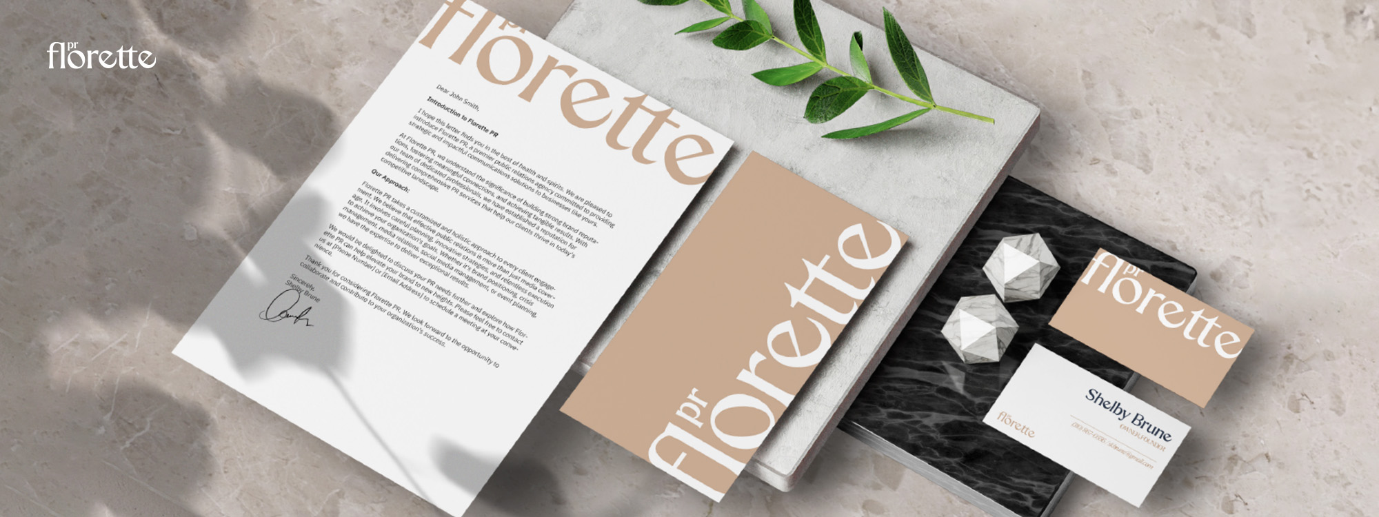
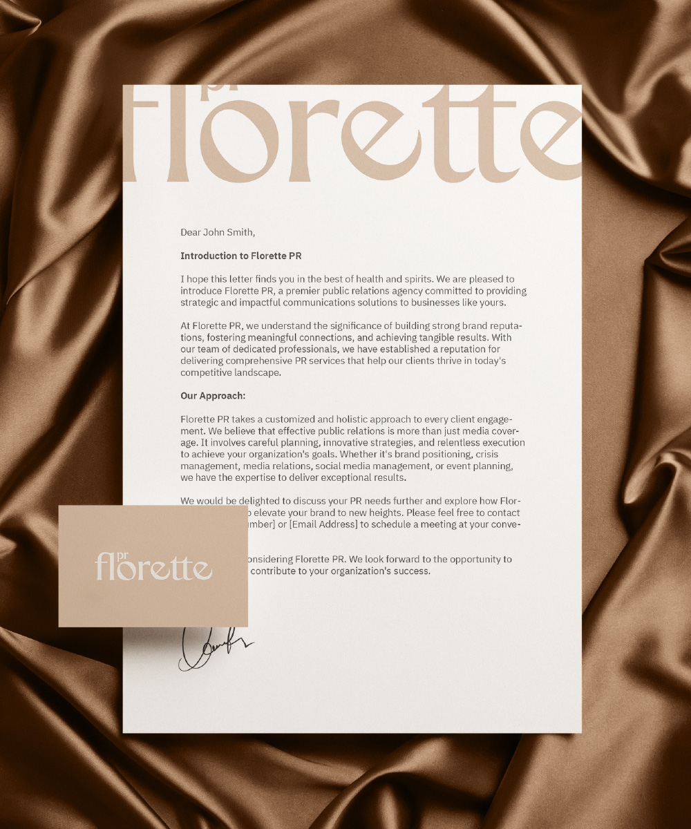
The "Florette PR" logo is a masterpiece of elegance and
professionalism, designed to capture attention and convey
sophistication. The logo is a representation of the brand's
essence, combining typography with subtle elements that enhance
its visual appeal.
The brand name "Florette" is showcased in a captivating
creme-colored serif font. This choice of font adds a touch of
classic refinement and style to the logo. The gold hue not only
signifies prestige but also adds a sense of warmth and
approachability to the design.


The creative journey of crafting the "Florette PR" logo began with
a deep dive into the brand's identity and aspirations. Thorough
research into the realm of public relations and the target
audience's preferences provided a solid foundation for the design
process.
The essence was to achieve an elegant yet modern logo that
symbolized both professionalism and creativity. The choice of a
creme-colored font for "Florette" was a deliberate one, as it
exudes timeless sophistication and warmth. The creme hue, known
for its prestige, was perfectly aligned with the brand's values.
The subtle tilt of the "e" letters introduced a distinctive visual twist that added a playful edge to the typography. This design choice signified the brand's contemporary approach and innovative thinking. The logo needed to strike a balance between classic professionalism and a forward-looking outlook, and the "e" tilt achieved just that.
The positioning of "PR" atop the letter "o" was a strategic move, effectively conveying the brand's core services while maintaining a cohesive visual harmony. The use of smaller letters for "pr" added a touch of subtlety that complemented the overall design.
Iterations and refinements were integral to the process. Each element was meticulously adjusted to ensure that the logo conveyed the desired message and visual impact. The end result is a logo that not only encapsulates the brand's essence of professionalism and creativity but also stands as an iconic representation of "Florette PR."
