Contact Details
sales@thrasker.com (813) 565-9024 10901 Danka Circle North, Suite BSt.Petersburg FL 33704

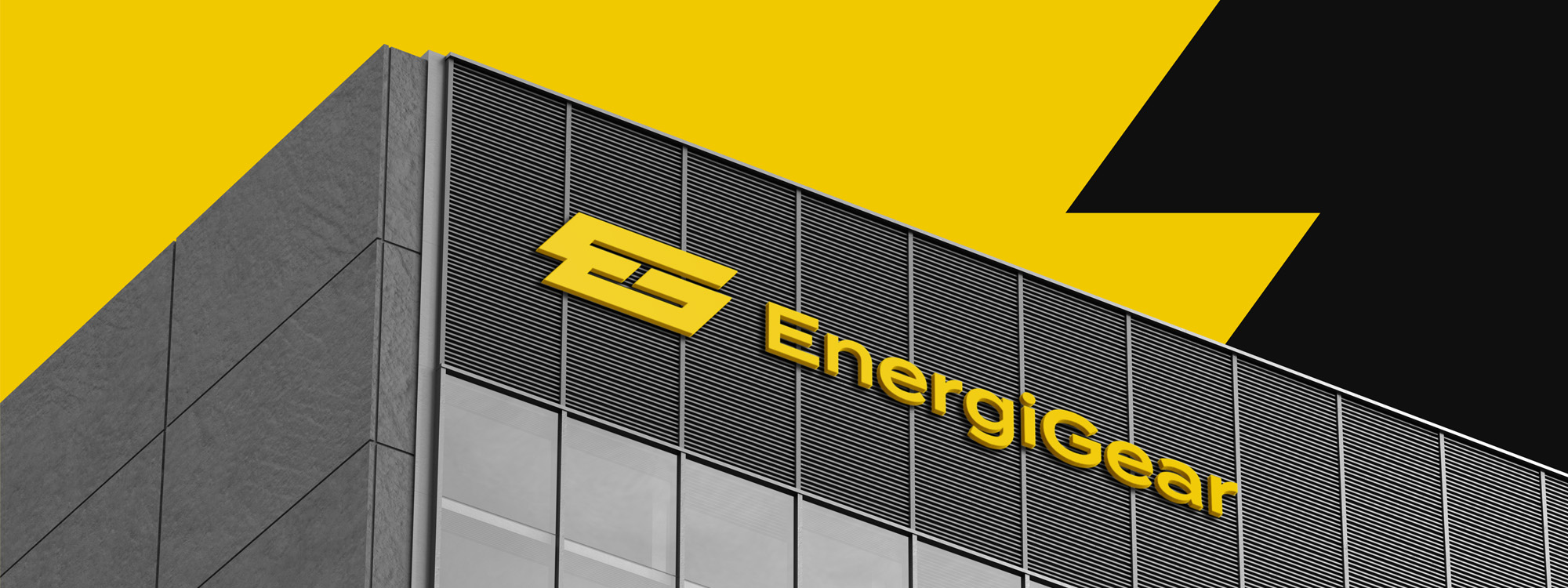
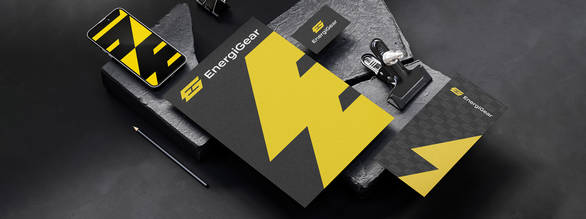
The "EnergiGear" logo is designed to reflect dynamism and innovation. The brand name is rendered in a cohesive sans-serif font, seamlessly merging "Energi" and "Gear" to create a unified and energetic look. The combination of colors, typography, and iconography effectively captures the brand's identity and values while showcasing its energy and innovation.


The creative journey of designing the "EnergiGear" logo began with
a deep dive into the brand's essence and mission. Through
extensive research, the designer gained insights into the energy
sector and innovative solutions. The challenge was to seamlessly
integrate "Energi" and "Gear" while creating a dynamic visual
identity.
Conceptualization started with typography. A sans-serif font was
chosen for its modern and clean lines, symbolizing progress and
innovation. The letters "EnergiGear" were artfully fused, unifying
the brand's two core elements into a single, impactful wordmark
that reflected the brand's mission.
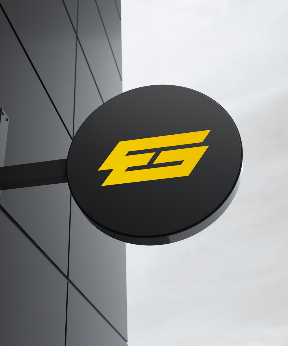
The logo mark development involved crafting an icon that captured the initials "E" and "G" while representing the brand's energy-driven approach. A vibrant yellow hue was selected to exude energy and positivity. The abstract design ingeniously blended the letters into a fluid form, expressing a sense of movement and dynamism.
