Contact Details
sales@thrasker.com (813) 565-9024 10901 Danka Circle North, Suite BSt.Petersburg FL 33704

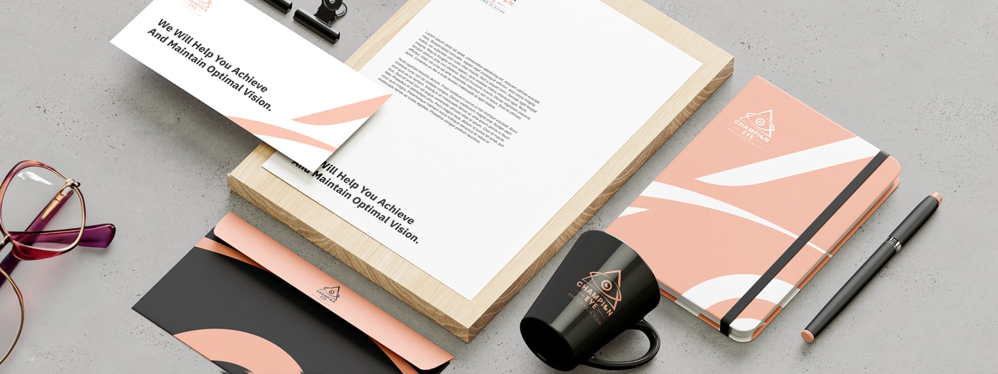
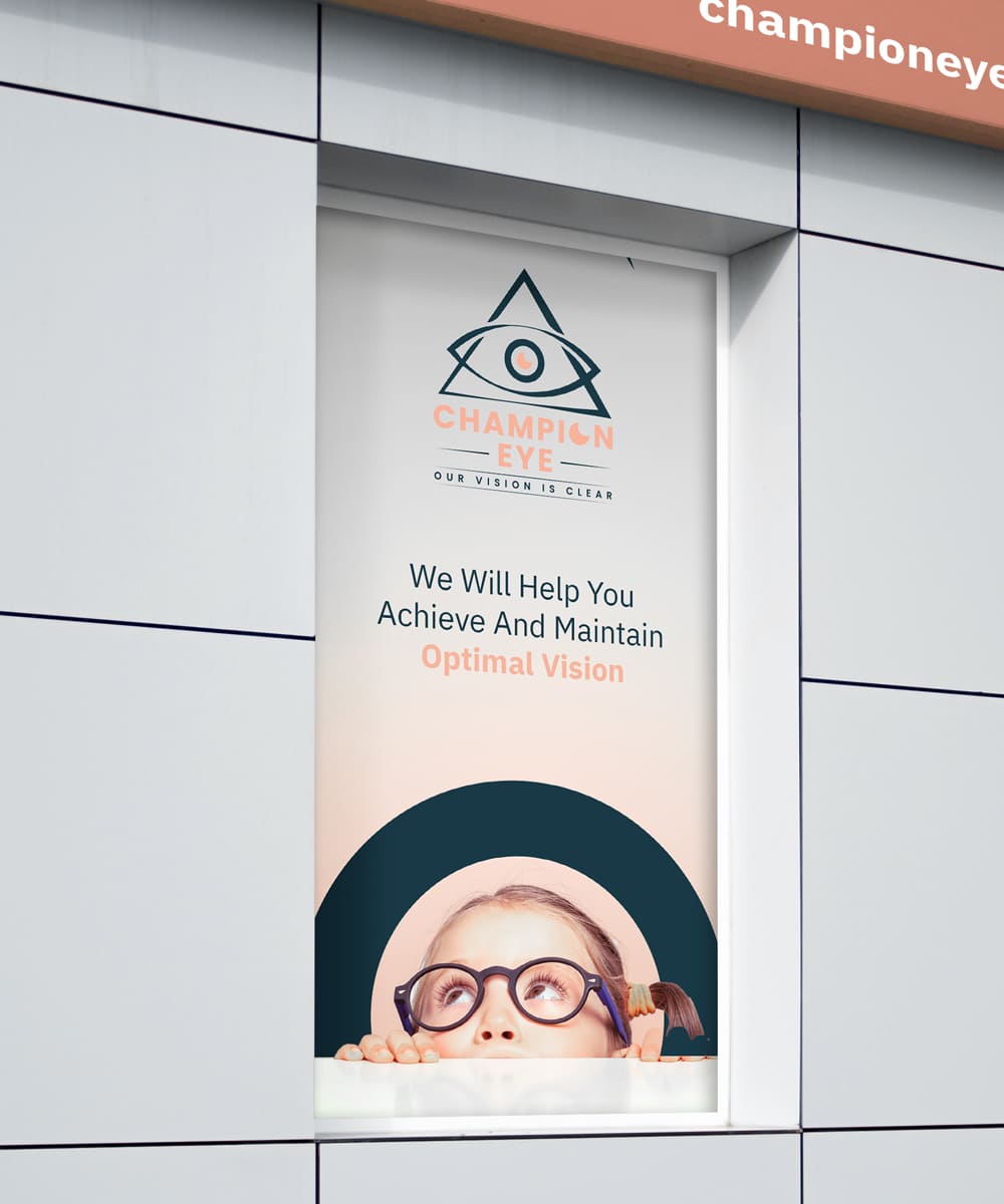
The Champion EyeCare logo design is a visually compelling and
memorable representation of the company's commitment to delivering
top-notch eye care. It combines bold typography with a distinctive
logo mark to create a strong and cohesive brand identity.
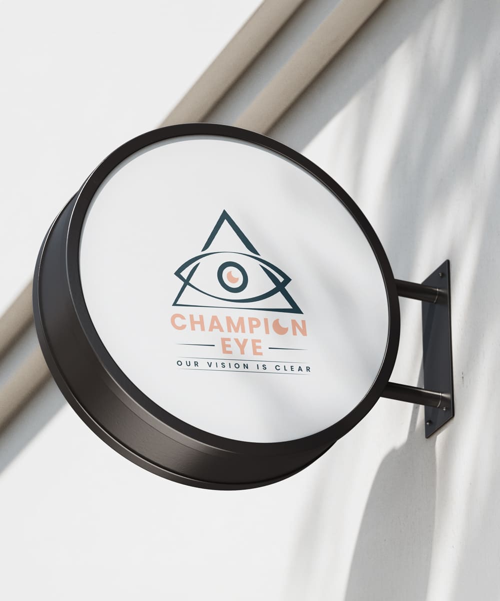
The logo design features the company name "Champion Eye" in bold
and prominent peach-colored typography. The choice of a bold font
style conveys strength, confidence, and expertise, while the peach
color adds a touch of warmth and friendliness. This color palette
creates a visually appealing contrast and ensures that the brand
stands out.


The choice of a bold font style conveys strength, confidence, and
expertise, while the peach color adds a touch of warmth and
friendliness. This color palette creates a visually appealing
contrast and ensures that the brand stands out. Above the
typography, a captivating logo mark is incorporated. It takes the
form of an eye enclosed within a triangle. The eye represents
vision, clarity, and the core focus of Champion EyeCare's
services. It serves as a visual representation of the company's
dedication to improving and preserving eye health. The triangle
symbolizes stability, balance, and progress, reflecting Champion
EyeCare's commitment to staying at the forefront of the
industry.
The logo mark and typography are thoughtfully positioned and
balanced to create a harmonious composition. The negative space
surrounding the logo mark and typography is carefully considered
to ensure readability and visual impact at various sizes and
applications.
