Contact Details
sales@thrasker.com (813) 565-9024 10901 Danka Circle North, Suite BSt.Petersburg FL 33704

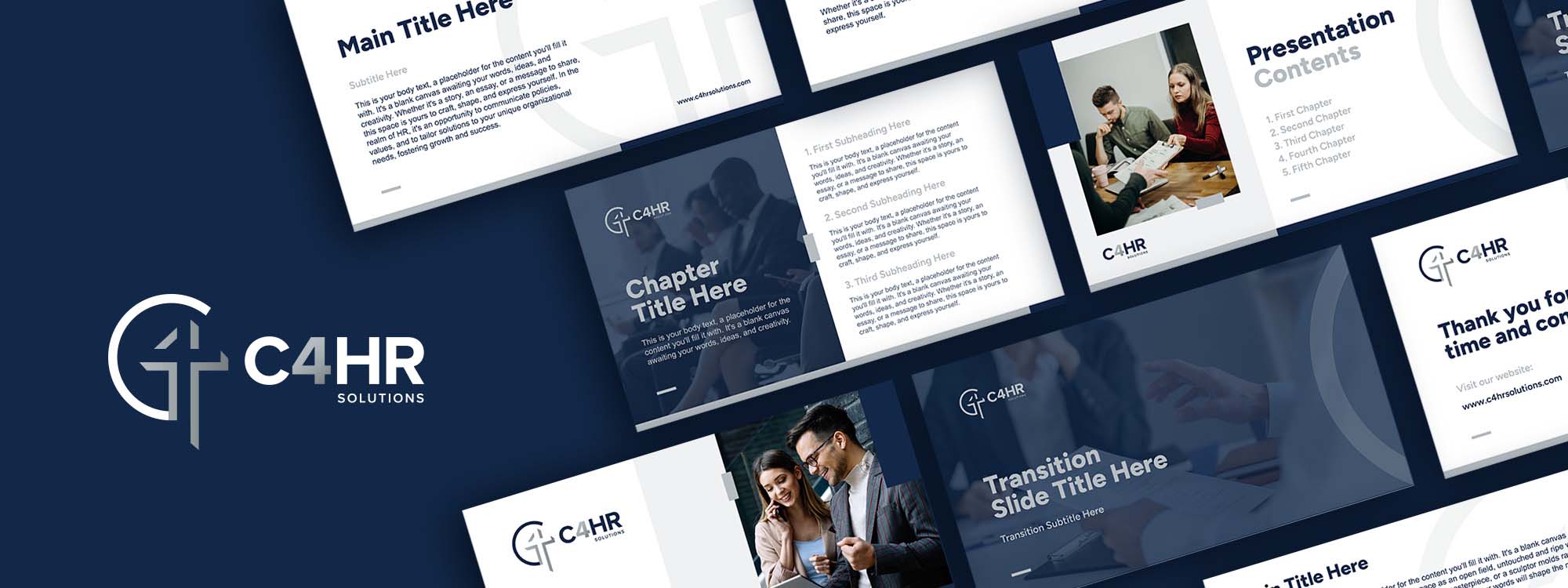
The C4HR Solutions presentation slides exemplify a sophisticated
and professional approach to design that communicates clarity,
authority, and expertise in the human resources field. Through the
use of established design principles, these slides are not merely
informative but also serve to reinforce C4HR's brand identity and
core values.
The slides are designed with a clear visual hierarchy that
immediately draws attention to the most important elements. Titles
are prominently featured in a bold, sans-serif font, creating a
stark contrast against the dark background, ensuring that they are
the focal point upon first glance. This is complemented by
subtitles and body text in lighter weights and smaller sizes,
guiding the viewer through the information in a logical sequence.


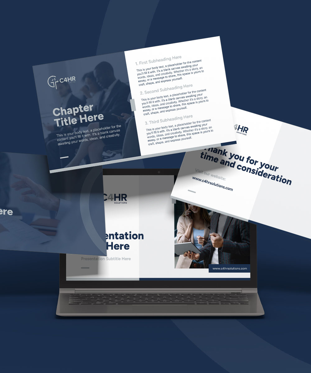
Layouts are crafted with precision, balancing white space and content to avoid clutter. Information is grouped into digestible chunks, with a mix of single-column and multi-column formats that facilitate easy reading and comprehension. Images and text are aligned purposefully, creating a sense of order and professionalism.
C4HR’s slides are grounded in a deep navy blue palette, a color associated with knowledge, stability, and trust — key attributes for a company in the HR sector. The consistent use of this color reinforces brand identity and provides a neutral backdrop that makes the white text stand out for readability. Accents of a lighter blue are used sparingly to highlight critical elements, aiding in navigation and emphasis without overwhelming the viewer.
The typography within the slides is carefully selected to reflect
the brand's modern and straightforward approach to HR solutions.
The sans-serif typeface used throughout the presentation is
contemporary and accessible, which helps maintain a corporate and
clean aesthetic. The use of capitalized lettering for main titles
adds a touch of gravitas and formality appropriate for a business
context.
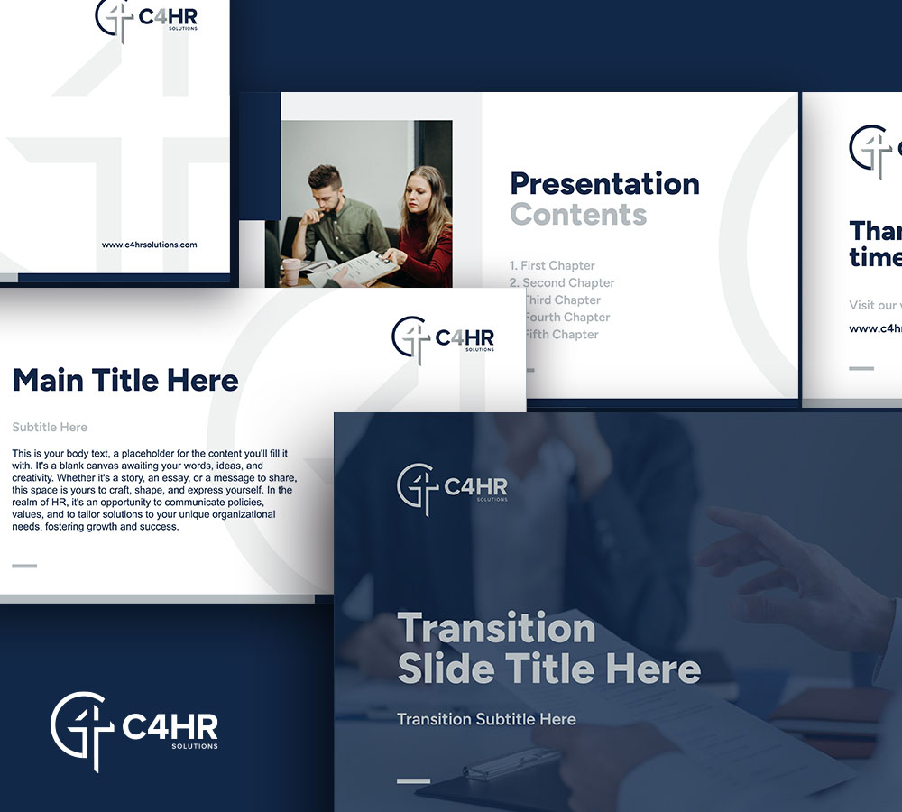
Images used in the slides are professional and resonate with the
theme of teamwork and collaboration, which are central to the HR
function. They are strategically placed and cropped to complement
the text rather than distract from it. Icons and graphical
elements are minimalistic, aligning with the overall sleek design,
and serve to guide the viewer's eye or illustrate key points
succinctly.
Every slide features the C4HR logo, ensuring consistent brand
presence without being intrusive. This subtle placement plays a
crucial role in reinforcing brand recognition throughout the
presentation. The slides also maintain a consistent use of fonts,
colors, and stylistic elements, ensuring that each slide is
immediately identifiable as part of the C4HR brand.
