Contact Details
sales@thrasker.com (813) 565-9024 10901 Danka Circle North, Suite BSt.Petersburg FL 33704

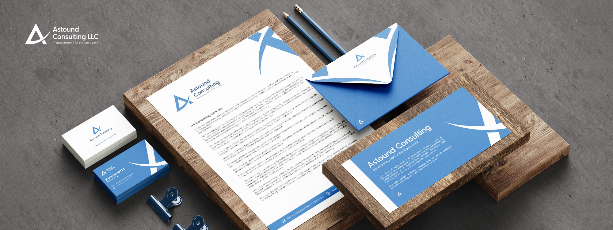
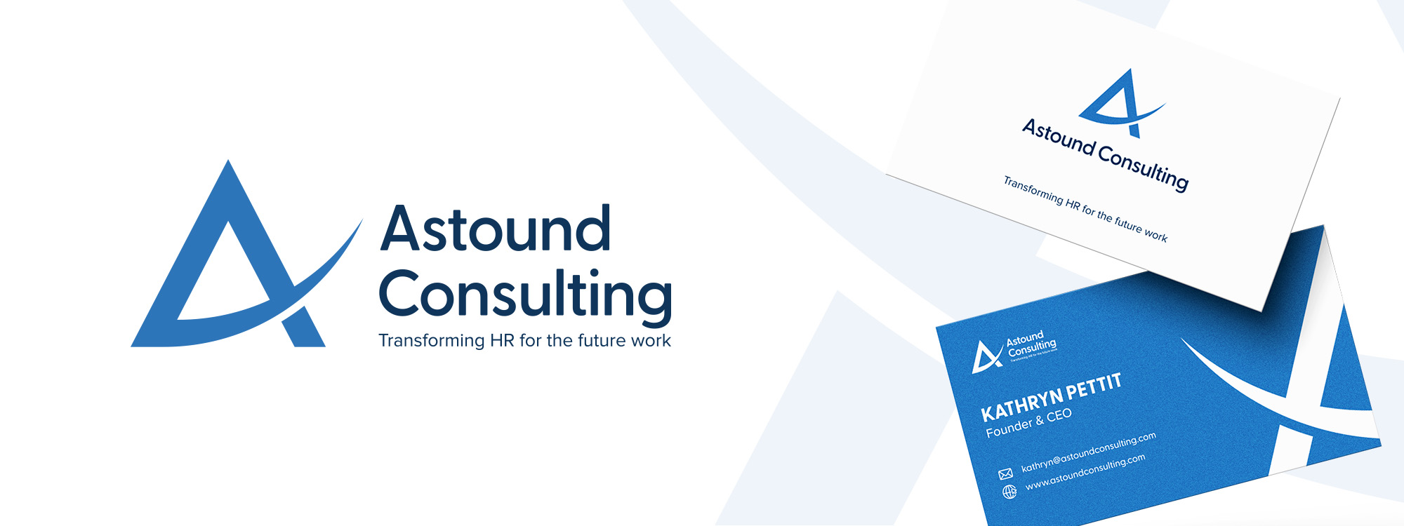
The "Astound Consulting" logo is a blend of innovation and professionalism. The logo mark's creative design, coupled with the strong and confident typography, effectively communicates the brand's commitment to transforming HR practices for the future. This logo stands as a powerful visual representation of the brand's identity and expertise in the consulting domain.


The creative journey of crafting the "Astound Consulting" logo began with a deep dive into the brand's identity and aspirations. Thorough research into the realm of public relations and the target audience's preferences provided a solid foundation for the design process.
The logo mark took center stage in representing the brand's innovative spirit. The letter "A" was carefully crafted, with the middle section extending beyond its boundaries. This design choice symbolized the brand's philosophy of pushing limits and venturing into uncharted territories. The light blue hue, chosen for this element, resonates with qualities of clarity and progress, perfectly capturing the brand's forward-thinking approach.
On the right side, the typography "Astound Consulting" was meticulously selected. The navy color, known for its professionalism and trustworthiness, was a natural fit to convey the brand's expertise. The typography was crafted to strike a balance between elegance and impact, echoing the brand's versatile services.
Beneath the main text, the tagline "Transforming HR for the future
work" was carefully incorporated. This succinct yet impactful line
underscored the brand's core mission. The choice of font for the
tagline was designed for legibility and harmony with the main
text.
Throughout the design process, multiple iterations were explored
to achieve a harmonious balance between the logo mark, typography,
and tagline. The color palette was meticulously evaluated to
ensure contrast and readability while conveying the brand's
essence.
The final result is a "Astound Consulting" logo that seamlessly
blends innovation with professionalism. The logo mark's bold
design combined with the strong typography communicates the
brand's dedication to reshaping HR practices for the future. The
logo stands as a visual representation of the brand's identity and
expertise, embodying the essence of transformation and progress.
